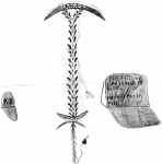
The Scythe
A sketch i have been working on since i got my new scanner. done with mechanical pencils and mars plastic.
Post a comment
Constructive Critique requested.
Please login to post comments.
Comments

pazazz The weapon looks like it would be an interesting part of anyone's arsenal, but the lack of consistency in the drawing hurts this one. The shading is too rough and takes away from the image by making the eye wander too much. The weapon itself looks unbalanced as it is drawn here and would be hard to handle. Practice, practice, practice, would be my advice. Reference your work, and keep trying. I look forward to seeing your improvements. Thanks for sharing.
Art RPG
Characters
Share
Tags
More art by inucune


Visibility
- ✅ is visible in artist's gallery and profile
- ✅ is visible in art section and tag searches