
Trouble Brewing...
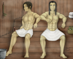
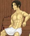
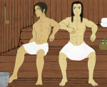
Yes, once again my muses have been arrested by my favourite cop character Wolfgang Oden. This time though his swordmaster/bounty hunter twin brother Heinrich wanted in on the action too so how could I say no? Eventually it will be the two of them sitting in a sauna but since its a WIP, you'll just have to deal with them in flat colour.
Any advice for their legs and feet would be appreciated. I hate drawing feet... ><
And yes I have a lineart without colour (or towels) but I dunno if I should upload it... try and convince me. :P
Post a comment
Please login to post comments.




I'm not sure what you mean about the thighs but the belly button always gives me trouble. I did use reference pics but the correct placement still eludes me. Rawr...
Main things I see-
*The waists tend to be a little too skinny. Even bishie men are a stockier form than women. It also flattens off alot when the arms are up. Men's chests are kinda weird that way.
* The short haired guy's right leg is rested on the ledge more cause it's twisted away- that means his foot can't reach the ground. That'll throw you off cause you'd need to make the leg longer to compensate, which you did. I've given a very rough sketch of where I think it needs to be... Can you tell I'm bad at toes... thus the scribble XD Lol
*That bottom ledge needs to be raised.
*The thigh corrections are there. You got it nearly there. I can tell you used references though
*Still bugged with long haired guy's pose. I think its cause of his legs- they're not relaxed. I think the feet need to separate more to being below the knee. Give him a center of gravity
* The heads are a bit big, but that's ok. it's all style in the end. It's if you're happy that's important with that kind of thing. I though I might point it out in case it was unintentional. It does make them younger looking which has a bishie flavour so its not a bad thing ^^
The above stuff are like... nitty picky stuff. You've got the basics there, and the picture tells a story which is the big thing
* yeah, I'm still working on the waist thing. I like how the short haired guy's torso turned out but I may thicken him up a bit.
* I was going to try and make the seat they're on angled slightly but I may have to get the background done first then make adjustments accordingly. I hate backgrounds!
* definitely toned.
* Yeah, its partially intentional since the long haired one is almost never relaxed around his twin mostly because he never knows when the next 'attack' is coming. Still, I'll see what I can do with his feet since his pose bugs me a bit too.
*Another issue I have but I think if I buff the bodies up a bit that might help. I am happy with the shorter haired one but the other needs work.
You are awesome! Thank you!