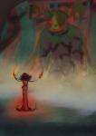
Tron Legacy- Sam Flynn WIP
I hadn't drawn from reference for a long time when I started this picture in April, and I also wanted to see how much I've learnt about colour with trying to learn it, so I decided to draw a coloured pencil picture of somethign that was relevant to me at the time (and still is :D ) It was meant to be a present for myself in 2013, but I think it'll be more like my birthday in 2014 when it'll be done XD hopefully not though- I'm making a lot of progress on it :) I just had the face till less than a month ago!
Media:- Faber Castell Polychromos on Hahnemuhle Stella card- A4 in size (Whole picture)
Post a comment
Please login to post comments.


Thank you though
Aww I see. Yes it's good to put things hold at times (but gosh sometimes I do that for years, heh heh). Looking forward to see it finished.
Usually I resort to loading in a photo reference directly, and then using the eyedropper to grab the colours. But it still is challenging. Your idea of mixing warm light with cool shadow or vice versa sounds very smart.
If you understand fundamentals with colour and light while colour picking it's better, but I think eye balling it and seeing what works well is better to me unless you're colour picking a digital painting for these reasons. The cool thing with eyeballing it is that it gives your brain a work out, so when you've done it a few times, it gets easier to do it. I primarily eye ball colours. I'm inaccurate, but every picture I do I get better at making it work for the though. I'd... recommend you a great book on light fundamentals (http://www.amazon.com/Color-Light-Guide-Realist-Painter/dp/0740797719), but it's too advanced for me so I don't know if it'd help you out, or just freak you out and scare you off the whole thing
This was the first picture I did while learning colour. I started off with student brand pencils and only 48 colours. I was so use to black and white only that I got contrast, but my hues were totally weird cause some were too saturated, and some were not saturated enough. I did a lot of research on pencil techniques, and I was learning a lot of methods that required Artist grade material so I got myself a set of 60 Faber Castel Polychromos(I think in America, you guys have Prismacolor as the go to pencil. It's a wax base rather than oil base pencil. Some prefer it
Anyways, I think you should give eyeballing colour a go. Compare the amount of warmth and cold in a colour to the source and turn both images into grey scale to see if the luminosity is good. Don't go for perfect- go for what feels right. I think you'll find that you come up with more friendlier results when you trust your instinct more than the eye dropper
"Photos can have a 'Christmas light's' effect where 4 pixels together can be totally different colours while zoomed out are totally fine"
I've noticed this problem. No particular one of the colours are right. So then I have to eyeball the colour anyway, which seems to be what you're getting at. And perhaps doing what I have been is like leaning on a crutch. It isn't necessarily teaching me to develop an eye.
Thanks for the book referral - James Gurney no less. He is an incredible artist--I absolutely love his Dinotopia books
Excellent idea on the greyscale too! I would never have thought of that. I know some artists do everything in greyscale first and then layer on the colour afterwards - that must be why. I checked the images I've been working on (converted to greyscale) and they did not look bad - though now I realize they could perhaps use more contrast in the shadows.
Can you please glance at this painting and comment on the light/colour? http://www.paperdemon.com/art/view/33950 There are several things that bother me about the picture, and the light/colour is one of them. That is supposed to be moonlight and pale/cool skin tone. I'm not sure anything is specifically wrong with it, but I'd welcome your thoughts.
Thank you again for all your advice!
With the Christmas lights thing, you CAN get colour pickers that take an average colour of an area of pixels, but I'm nto sure what version of Photoshop does that. It'd be an option under the eye dropper if you have it. It's still a bit of a dodgy method though for the other reasons I listed
Yeah- he's got GORGEOUS art and when I read his book, his level of understanding for what he looked at was not only extensive, but very easy to follow. There's a LOT of information in there though. I'd suggest doing what I'm doing and get confident with colour, then learn each fundamental 1 by 1. There is SO MUCH to talk in from that book. It'd be the book I'd recommend for fundamentals though, definitely
Doctor Who pic- Yeah, I picked that one cause it had weird lighting on it with that blue
Doing stuff in greyscale first is a method that some people do to keep contrast, btu keeping an interesting hue range is just as important. I've seen some tutorials where people set up Photoshop so that they flick their picture on and off greyscale with the channels to see how it looks. I adopted a method which has the thumbnail option in photoshop where you have a small version of the image. If it reads well in tiny form, then it's an effective picture
Oh- you can thumbnail your image inline if you use the [thumb#####] tag on PD
I feel that the woman blends into the background too much. I feel that the background should be closer to black so that her form is mapped as there, cause I don't think she's meant to merge with it? Sometimes putting some ambient lighting to separate her from the background can be a thing. Perhaps the room behind her is palely lit? Something to give her silhouette a soft edge. That with colour change would spell out that she's not meant to merge with the shadows. I also feel her face is very stark. You may *want* this sterile look depending on if she's a dead pan expression character. If she's more friendly though, I'd suggest giving her face some more shape to balance off her dark lips. For moon light, it depends on how intence you want the scene to be. You can give it a cold lonely feel and make it that blue, or make it more serene and give it a more natural look by doing a slightly blue light (cold light) on just the peaks of her, and blend it out gradually and have na equally intence warm shadow to compliment it. Having a shadow the same intensity is important. If your highlight is intense but the shadow is not, it'll change the perceived colour of the object. If the object has a metallic or gloss finish of some sorts having a small pine of cold white is fine, but only a tiny one to show the surface texture. Skin has a slightly gloss finish due to the oils in our skin, but nothing that would reflect a pure white without it being washed out. When you decide the mood of the picture, that's when you decide on the light intensity and colour. Or... that's how I see it. Again- I'm still learning all of this so do experiment
And no problem
I always avoided colour with any non-digital work. It always seemed like the moment I started using coloured pencils, all the nice b&w work I did would just be annihilated. I have to admit part of the draw of digital for me was just that--since I can hit "save" as much as I want, it is tough to destroy anything by experimenting on it.
"With the Christmas lights thing, you CAN get colour pickers that take an average colour of an area of pixels, but I'm nto sure what version of Photoshop does that. It'd be an option under the eye dropper if you have it"
I still agree with you that it's a crutch; I'll start eyeballing it and see if that helps me. Plus, I use Paintshop. Easier to use, but fewer capabilities.
"It was big surprise to me just how blue it was."
I notice I've started to reframe my thinking about what colour "is." I mean, technically skin for example really is blue under blue light. It's only fleshtone under neutral light. The tone brings warmth into the blue when it mixes with the light, but it's still ... blue. I am not sure why that is hard for me to wrap my head around.
The David Tennant episodes accounted for a lot of my favourites. Season 4 with Catherine Tate is still my very favourite season. I wish I could watch the classic episodes, but I can't seem to find a good deal on them anywhere. The BBC seems to insist on releasing them one at a time instead of in nice packaged sets.
Previously the woman in my picture wasn't merged into shadow like that, but it looked unnatural to me. I'm thinking though that maybe it would look more correct if I used a warm colour and did a very fine/faint backlight like you are suggesting to imply a light from somewhere behind her. That also might bring a tad more warmth into the picture (otherwise, I was going for sterile/stark/cold). Problem before was probably that the backlight was the moonlight again, which didn't make sense to me. She is also a rather rigid/expressionless person, but I'm still wondering if you could give me more tips on your idea of "giving her face more shape"? Because it's not something I excel at, and I need to know it for other characters. I've been reading more comics lately in part for that reason. Comic artists seem soooo much better at that than most artists.
" or make it more serene and give it a more natural look by doing a slightly blue light (cold light) on just the peaks of her, and blend it out gradually and have na equally intence warm shadow to compliment it." Also probably not what I'd want on this image, but an awesome idea which I will keep in mind for future moonlight images! I've been paying more attention to how TV directors handle nighttime lighting, and I notice they have to make all these decisions too. Scenes which are colder/more depressing they leave in all blue, but scenes with more warmth in them they do exactly what you suggested.
Anyway, another cool thing about digital is that there's no reason I can't save a second copy of this image, switch to to greyscale, and re-colour it in a different way to practice/experiment.
The flesh tone blue thing... it's a lot to take in. That's why it's hard. it's why it sometimes has to come down to trial and error- see what works. I could tell you stuff if I knew, but it wont mesh till you try it. I suggest attacking one problem at a time, and making a doable check list of things to learn that are important to you, then isolating that one thing down. Linearts are hard? Find a pro artist's pencils, print it off and practice on that. Nice finishing techniques a problem? Copy an artist you like and credit them. Dont' like the effect of your medium? Find a new one and try it out on something you're comfortable drawing. The whole picture doesn't need to be a change if you're learning.
Giving her face shape... Urgh- I dont' know how to explain that all, sorry. I don't know what your light source is meant to be like, and what her bone structure is. I can say the generic planes of the face, but I think perhaps you'd get more out of it if you did some grey scale studies of faces in different angles or lighting conditions. It's *really* hard for me to give you confident advice on this cause the colour is a major part of this, as well as the face its self. I could only give areas I'd expect a shadow based on what you have here, and the face shape you're portraying may be in accurate to what you want to portray.
A suggestion I CAN give is for expression however
My advice though? Leave this picture for now and move on for a while. A big thing people have when learning is perfectionism and sometimes driving in the deep end first is not a good idea if you don't have a deadline. I often ditch a partial sketch, doodle, lineart, or coloured image half way or in the process somewhere if it gets too hard, and often I'll go back to it a fresh. Move on for a month or two and swat face shapes/ colour or what ever, and go back to the picture knowing for yourself and *understanding* what needs to be done. That's my advice. Keep all your art in a clear folder, revisit it often, and don't be affraid to abandon art you're not ready to draw. You gave it a really good effort, and you should be proud of it- there's no shame in leaving it for a while at all
lol. I have a problem with my brain doing that all the time, even when I'm not doing something creative. I never thought to chalk that up to runaway artistry as opposed to some problem with my brain not functioning right.
"Mistakes can be beautiful."
That is so true. When I make jewelry, I have a rule that I never discard anything. If I don't like it, I just keep working on it until I do like it. I have literally never discarded a piece in progress. And even discarded elements usually get used later in something else. People ask me my techniques, and I am like "Accidents!"
Thank you for another great looking reference on facial expressions. While you are at it, I have a request. I am only just getting into comics. I would love to see a list of your favorites. =D
Thank you again for all of your help and support!