Broken Angel

Posted Nov 22, 2006, 1:07:01 AM UTC

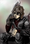
This is a sketch of ani skywalker:jedi: that, out of boardome, i have colored. This was done quickly,and probably should not be in the 'finished' pile, but  as i'm not going to touch it after this ..i guess it s finished? Moreover, feel free to be a harsh crit! Please, its the first time i've drawn him and i want to see if i got it right:innocent: Thank U!....I realise that the tile may be alittle too dramatic^.^;; again, i have no idea why he has 'magically-uselless' wings..:blink:..:question:

Post a comment

Constructive Critique requested.

Please login to post comments.

Comments

  • Apr 10, 2007, 5:30:42 PM UTC
    I personally think you did well on this except the hair does not have the detail the rest has, almost as if you rushed it. I didn't realize the wings were there until you mentioned it... I thought the missing one was some kinda fungal infection or part of the background. Overall, 8/10! This is a really cool piece, and if I owned it, I'd hang it up.
    • Apr 10, 2007, 11:30:40 PM UTC
      I realy hate that i desparaely rushed this one, i should have gave it my full effort..epc.the hairWhat?. Thank you thought that realy lifts my spirits!
      • Apr 11, 2007, 1:48:34 PM UTC
        Ah, don't sweat it. The way I see it, the less effort you put into this, the more effort you can use on a different one.

        (Besides, I have no right to criticize because I rush everything I do. I'm probably the most impatient person on here...)
  • Nov 24, 2006, 8:52:57 AM UTC | Total Edits: 1 | Last edited on Nov 24, 2006 by Humority
    It's not too dramatic at all.^^ I love the intensity of his face and the way he sits, I think you've done a great job drawing this.Yes
    I don't have much to add to what arkillian said except that the darkness of his face bothers me. It's not supposed to be as dark as his coat, I'd suggest not using black in his face but lighter tones, maybe brown but not the same color as his hair.
    Somehow I feel it would be even more powerful if the background was more saturated. Still, great job and a new fav definitely.Big Smile
    • Nov 24, 2006, 9:58:50 AM UTC
      Thank u, every crit helps me! And i treasure them allWacko! Yes the line art is okay, its the coloring that throws me off. *i should have tried harderNo* i wanted the face to be the represantation of how far into the dark he's ventured, but i don't know if it capures it. Anything other that you catch?
      • Jul 27, 2007, 1:58:00 AM UTC
        Hey there, sorry I didn't answer you, I forgot all about this^^;
  • Nov 22, 2006, 8:12:33 AM UTC
    i think he looks yummy
  • Nov 21, 2006, 7:36:33 PM UTC
    Wow! OMG! This looks great Yes a definate fave for sure. As for crits hmm I think his hair might need alittle more work. It looks a bit flat. Nothing a few bright highlights can't fix though ^^ Arkillian pretty much covered the rest Sweat Drop but yeah great stuff! Thumbs Up
    • Nov 21, 2006, 10:16:53 PM UTC
      Thank soo mch, i was looking faword to you crit.. and nice try- 'E' for effort!Sweat Drop Also does it reseble Aniken?
      • Nov 22, 2006, 6:14:05 PM UTC
        You're welcome ^^ Yay E for effort lol ^^ and yeah it definately looks like Aniken. when I first saw it I was all "Darth Vader!! XD" lol
        • Nov 22, 2006, 10:42:59 PM UTC
          Thank u! And the idea was 'the creation of darth v-master' after a long days work and no one to come home to(depressed)..(frustrated)..oh and i tottally forgot-that would be every night, unless obi-wan... Anyways you get the picture* a long nights ponderring of which side of the Orio he is* lol but you knew that alreadyLaughing
          • Nov 24, 2006, 12:26:48 AM UTC
            lol Grin don't worry your pic screams with an awesome concept doesn't need an explanation.
            • Nov 24, 2006, 1:17:03 AM UTC
              TrueYes But details are niceGrin....some..Annoyed
            • Nov 24, 2006, 1:17:04 AM UTC

              This comment (46997) has been marked as hidden by the submission owner or a moderator.

            • Nov 28, 2006, 5:13:03 PM UTC
              Thanx!!!!Hug
  • Nov 21, 2006, 6:28:39 PM UTC
    The title isn't too OTT to me- he was once innocent- a little too purist in fact.

    Crit though? Althought the dirty look sort of suits the picture, you have lost out on details and textures with the way the colours are slapped on. Smooth areas like the face and clothing can be blurred, although some areas need to be sharp, but things like the hair need a bit of attention cause it's a glossy surface- it has sharper colour changes.

    Also, The lighting is inconsistant- most of it is above him, but it's not enough to make a gloss where the light comes from- if something blocks the light, that needs to be a sharp shadow. Also the contrast between the shadows to light is too quick for what is shaded here. A high intensity shadow needs to be complimented by a high intensity light hitting it, where it nearly becomes a black and white picture. Alot of rules can be broken, but this can not. You need to toe most of your shadows down so that only the really dark areas are dark, and the other shadows are medium to compliment your light areas.

    Uhhh- FYI for the next picture Smile
    • Nov 21, 2006, 6:55:03 PM UTC
      Dance THANK U! This was half assed Embarrassed,but the insite you've gave was a big help. I can see what youre getting at- the shadows are too sharp and its a strain to do detail with a mouse..god i wish i had a tablet..Anyway, i was going to leave this as a pencil scetch, but decide to color it in less then, what, 2hrs.Thus, the horid coloringSweat Drop. I feel all mushy inside that you would take the time to crit this. I will surelly use your advice in my next piece! And Q: Whats ott?
      • Nov 21, 2006, 7:05:28 PM UTC
        Sorry ^^; OTT= Over the top ^^ Yeah- anyone that wants crit, I'll give it- it's no problem. As long as you'll use the crit. Colouring with a mouse sucks. All I can suggest though if it does become a birthday gift thing though- Wacom Graphire. Small one. Shouldn't cost much. It's sooooo worth it though! Yes

        I'm game if you ever need any more crit. I wont be kind about it, but I try not to be nasty either. Sometimes you just need to know how it stands Yes
        • Nov 21, 2006, 10:11:08 PM UTC | Total Edits: 1 | Last edited on Nov 21, 2006 by Kekoura
          Thanx, and i agree the world needs people like you who call it what it is!Grin

          Oh, and i just left to frys and got a wacom tablet 6x8 graghire4...as a b-day presantBlink R u phsycic by any chance?.. Weird..Huh?
          • Nov 21, 2006, 10:44:18 PM UTC
            *dies* No way! ^^ That's total LOL stuff!! Big Smile Well, have fun with it- I was there with the whole mouse thing. You'll be more inclined to put effort in with a tablet cause it's easier. Have a practice with it and see your limitations Yes They're good fun ^^
            • Nov 21, 2006, 11:09:33 PM UTC | Total Edits: 1 | Last edited on Nov 21, 2006 by Kekoura
              Thank uSmile. If its not too much of a bother could you clue me into the finer art of using one. Just the basics is what i ask for.. trial and error kind of stuff. i mean your art just has a kind of quirk i was curious if you could skim through the shallow of using the thing Innocent Pweese.
              And it was very ironic that i got a tablet at your cammand!LOL!
              • Nov 21, 2006, 11:38:17 PM UTC
                Well... There's no real quick fix with tablets- seriously. It's a digital pencil which makes it ALOT easier to use than an unergonomic mouse. The big thing is that tablet have no texture when you use them. That seems REALLY stupid for me to say, but when you use it, you'll understand. You can feel the pencil scraping lead onto the page. With the tablet, you feel nothing but the weight of your hand on the pen. Picking up the tablet was basic for me- getting use to the texture took ages.

                I suggest oekakis. I joined an oekaki board when I got my tablet and it's the BEST practice Yes Lots of quick easy things Smile Don't live on them, but it'll get you use to working with a tablet rather than a mouse Smile

                Sorry I can't be more helpfull than that ^^;
                • Nov 21, 2006, 11:45:23 PM UTC | Total Edits: 1 | Last edited on Nov 21, 2006 by Kekoura
                  Beleive it or not, that bit of info goes miles. I'll keep that it close, thank you. And do crit me harsh- that also goes a long ways, being barelly 15 and not having taken even 1 class in art- its pays to take whatever 'those who know what they're doing' say to heart. Ya Know? WackoImprovement is good.
                  • Nov 22, 2006, 12:03:46 AM UTC
                    Ohhh- I wish someone crited me when I was your age. I'd be alot further ahead with art than I am now. My current style is mostly due to teaching myself. I don't often get usefull crit for improving my style of things...
                    • Nov 22, 2006, 10:26:30 AM UTC
                      Sweat Drop if there is anything that i can help with i will!
                      • Nov 22, 2006, 11:31:26 AM UTC
                        ^^ It's ok. Just that any thoughts you have on my or anyone elses art- no matter how small- air it. Tell them. They may be better, or not better than you, but if they aren't told, they can't improve Yes

Art RPG

Characters

No characters tagged

Share


Tags

  • Kenny sketch
  • Political Shark
  • Fox
  • Pink with Intellect
  • Native Feel
  • Two Beauties?
  • Delusional
  • Back in the Day(Puff)
  • Detour to South Park

Visibility

  • ✅ is visible in artist's gallery and profile
  • ✅ is visible in art section and tag searches