
Princess WIP 2
I only finished sketching it out. All I have left to do is color and fix it up a little bit. I figured that I would upload this update and maybe get some input.
Post a comment
Constructive Critique requested.
Please login to post comments.
Comments
Art RPG
Characters
Share
Tags
More art by choppedwood


Visibility
- ✅ is visible in artist's gallery and profile
- ✅ is visible in art section and tag searches
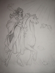

Just to get this out of the way, I am crap when it comes to drawing people, so anything that would need to be done with the princess is beyond my skill to crit. She honestly looks fine to me!
I do have a bit of skill with horses, though I do typically draw in an anime style.
Ok, enough about me. Let's start with the ear. Your horses ear seems a bit small and angled, almost too sharp, as is the head. The position you put it in would make the head larger, because it is coming at us (Though it is turned away, which makes things slightly more difficult.) To fix this, you can try thinning out the neck (which seems a bit wide)or you can make the brow of the horse bigger and extend the snout out.
I love the mane and tail on your horse; much better than any hair I have ever done. Mine typically comes out as a bloby thing on the horse. ^^"
The shoulders are usually a bit more prominent, but that really depends on the breed, age and style. I can see some marks you have for muscle, maybe when you color it they will be more prominent.
The legs seem a bit spindly and short, more like a pony. Once again, the hair on the legs is superb, but the hooves seem slightly rounded and small, or maybe I do mine too big. Which I know I do. I like the raised leg, you did a great job on it!
Well, I gotta get to class, but I hope I have been of assisstance to you, and I can't wait to see the finished project!
^.~