
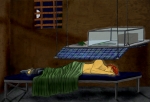
Sacrifice
I probably could have gotten the background a lot better had I been willing to put a few more hours into it... But I got frustrated really quick. I need to see if I can't find some brushes if I'm going to do rock again O.o That took far longer than it looks.
But I actually put a background that wasn't only swirly things! ... Not much past swirlies, but better. >.>
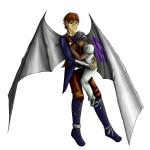
His face bothers me, though a lot of that is because I switched which character this was halfway through drawing this. Since I only created this storyline a little bit ago, Jan didn't even exist when I started this picture. Ikia wouldn't go for long hair anyway. >.>
The title is technically the kid's name. For a long time Jan wouldn't tell anyone his name, and they just called him sacrifice trying to goad him into giving them an alternate name, since that's what he was seemingly brought into their world as (They didn't want to name him, kind of like getting a cat that you aren't planning on keeping so just calling it Kitty, and five years later Kitty is still there).
Knowing the story this picture is a little more sinister than it looks, but I haven't really developed that yet so won't bother typing it up. Basically, Jan steals souls/essences and turns them into butterflies.
Critiques = <3 . I know I definitely need to change something but can't put my finger on it.
Post a comment
Constructive Critique requested.
Please login to post comments.




1) Composition: I think it's better to have the figure more towards the bottom if you are going to leave the picture with lots of empty space; that way the weight is towards the bottom and the pic doesn't feel like toppling over.
2) The cloudy texture: it seems very computer-generated, very straight from the Photoshop effect tools. I think manually hand-drawn clouds be better- altho more effort need to be spent.
Other than that, I think it's pretty good; I like the color composition. My sister is complaining about clothing for a guy- though one might argue that's up to the artist right to design.
I actually did draw out the texture by hand (couldn't get brushes to work for some reason), it just didn't come out very well at all. I'm still figuring that part out. <3
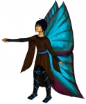
Heh, usually I'd agree on the clothes. In this case it's a mix of me having fun and his culture coming into play. They partially change shape, so the skirt is there for modesty's sake after switching from fin to legs. Boots and gloves are because they have an ever changing code on wrists/ankles that work like a true name in Sidhe myths. XD
Thank you! <3
I think you're right about those being the biggest thing bothering me. ^^ What clothing issues did you spot? For some reason I'm horrible at figuring out what's wrong with my own drawings.
I agree with te cloud filter looking bad in this case. Cloud filters are a weird thing to play with. At a close range, they look bad. [thumb15373] I used a cloud filter on this picture, and it works cause its not the main focus and the gradient map on top of it has given it a dynamic. You need to watch that with filters- they're easy, but look tacky if they're obviously a filter. Seriously- a large white brush at 5% opacity or something is more effective. Maybe some glittery bits randomly.
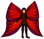
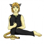
The other comment about composition is very true too. I don't want to go too far into it cause frankly, there is no clean cut rule, and there are ALOT of rules. http://www.silverlight.co.uk/tutorials/compose_expose/thirds.html This is the most BASIC of all rules that everyone should learn. The rule of thirds. Read that, and re look at the pic. There's alot more than that to composition, cause you don't always have to fill the picture with your subject- as long as it's clear what the subject is. A person, object, feeling- ANY thing. Attached a visual crit of some non linear flow lines. The first shows the rule of thirds emphasising the eye by it being central (ish) and in the top third line. The second is repetitious, but has a yin yang flow line- the contrast of the picture. The 3rd is a little lopsided cause it's unfinished, but is a heart in it's flow lines. The heart is also around their face which shows adoration and their hands.
Donno- getting tired. I think this is my last comment for today T.T Too early in the morning
*wanders off to bed*