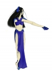
Blue Overload

Posted Jan 17, 2008, 2:33:19 PM UTC

An RP character of mine. She's a water sprite, and something of a slut. I need to draw her twin (fraternal, so they look different XD) as well.

Her scales were fun to color, and I like how those look (forgot the purple in her ears >.> ) but some things just look a bit off.

Crits = <3

Post a comment

Constructive Critique requested.

Please login to post comments.

Comments

  • Jan 17, 2008, 11:43:50 AM UTC
    I like how soft her hair looks and also her expression and the clear blue color. but her body needs more shape,its hard to tell if she is a woman or a pretty male, also add some shading/highlights to define muscles and shape.some kind of background would make the pic look more finished.
    nice work, keep it up.
    • Jan 19, 2008, 6:46:12 PM UTC
      Hm... more shape in what way do you think? (I can see what you mean) Since she's not in anything that would constrict her waist I don't want to give her more there, so all I can think of is to define her a bit better up top (I should probably edit that for shading at least anyway).

      I'm going to go back and reshade parts of this I think, so I'll see if I can't emphasize muscles a bit more when I do that ^^

      Thank you! <3
      • Jan 20, 2008, 1:27:41 AM UTC
        with more shape I meant give her a little more breast,maybe a bit more hips. and more difference in shading/highlights, that also defines the shape of the body.
        • Jan 20, 2008, 6:25:00 AM UTC
          Ah, that makes sense. I'll definitely change that around when I go back to re-shade then and see if I can't get her looking right. Thanks! ^^
  • Jan 17, 2008, 7:01:31 AM UTC
    What an interesting looking character, she must be fun to RP with. I like the soft look of her hair and the scales are well done. Her body needs more definition and shading. The drape of her skirt looks a little strange and you should use some darker values there, as well as, some contrasting shading to make it really pop. The plain background does nothing for this piece, placing a warmer color there may help to balance out all the cooler tones in the subject. Nice work, thanks for sharing.
    • Jan 19, 2008, 6:41:48 PM UTC
      Thank you! <3

      I can see what you mean about shading more, I'll probably go back and re-shade a lot of that.

      I don't tend to be that good at backgrounds (usually sketch them out, but rarely actually upload the picture with them) I hadn't thought about using a warmer color though. <3

Art RPG

Characters

No characters tagged

Share


Tags

  • Forgotten
  • The easy way
  • Aik WIP
  • Den WIP
  • Iria
  • Ikia
  • Sacrifice
  • Mer Sketch
  • Glass

Visibility

  • ✅ is visible in artist's gallery and profile
  • ✅ is visible in art section and tag searches