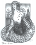
The values are wonderful on this piece. Nice darks and a good balance of lights. You made a point of stating that you used no references, and I think that is where this piece fails to hit the mark for me. The proportions of the face are way off and that continues on down the torso. You may have intended a longer neck than normal, but it does make his head look too small for his body. I suggest you DO reference to get a more correct look, the best artists always reference, even the masters did, there is nothing wrong with it. I like how you framed the background, but it does seem a bit like from a children's book. Nice work, thanks for sharing it with us.
I draw while I work, really, at home I never have the time or patience for this painstakingly shading. That's why I don't use refs... my colleagues aren't willing to pose ^^
Photographs from stock artists are always available and there are many tutorials that feature proportion and anatomy out there. Devaintart is loaded with resources that may prove helpful.
Wow, the shading of the scales and the patterns at his abdomen area is just mind-boggling. Though, the castle and trees at the back seem a bit too simplified when compared to the front. Facial proportions could be a bit off- but is made up for by the greatness in details.
Your submission is posted to our site but it hasn't yet been added to an Art RPG queue for point counting, approval, and/or reward redemption. Submit it to the queue to get your rewards.
Thank you for your comment.
Again in my defense... I have no internet at work. I work at work, and draw while I talk to customers on the phone. It's therapy! XD
Ah well, I'm proud at the tail and the details at his middle. ^^;