Shirtless Link

Posted Aug 20, 2005, 11:55:48 AM UTC
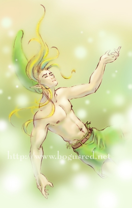
This is Link, from the Legend Of Zelda Nintendo video game. Not really going for a specific game. Perhaps something more like Ocarina of Time. But I've drawn him in my own style of course. :grin:

Sorry for the lack of a creative title. I haven't come up with anything good yet. :P

Anyway, I keep trying to create another drawing that's as dreamy and magical as this piece...
Art thumbnail

...but I'm not sure if I've succeeded yet. This one is closer than my last Paper Demon Link drawing...
Art thumbnail

Do you think I should crop in more? Make the focus more on his face, shoulders, and chest?

I've got multiple versions of this file at different stages. I plan to make a photoshop demo based on this piece.

With many of my photoshop pieces, my goal is color, not value. I am going for more of an expressionistic piece. That will be the focus of my tutorial once I get around to writing it. I don't see a whole lot of people really using color in this way digitally. I think peeps might be interested in seeing my process.

Thoughts, questions, concerns, suggestions? :ponders:

Post a comment

Constructive Critique requested.

Please login to post comments.

Comments

  • Jan 28, 2010, 10:03:18 PM UTC
    love the colors, light & shading-
  • Sep 25, 2005, 5:06:42 AM UTC
    I'm not that much into digital art, but here's my 2 cents anyway
    I think I love the last piece (with the wings) the most. The composition is beautiful, the colours and wings seem ethereal, but the longer you look the more you see.
    I think the first pic is a bit too 'crude' (I hope that's the right word), the lines could be a bit finer. I still love Link's face there (and let's not forget the fact he's shirtless Wink ).
    The second pic is too focused on his face and takes away a bit of all the movement that's evident in the other works.

    I'd love to see more!
    • Sep 25, 2005, 9:32:31 AM UTC
      Wow thank you for the detailed comments. If you were saying that Art thumbnail is the crude one, then I agree. (i'm not quite sure which one you were talking about).

      Are you saying that this latest one Art thumbnail is the one too focused on his face? I like the fact that the focus is on the upper part of the picture instead of the whole body.

      Anyway, thank you again for the comments Eleanora.
      • Oct 3, 2005, 1:05:07 PM UTC
        With the first one and meant the big pic, so it's just the other way around Smile It find it a bit crude because of the lines you use to define the arms and face. The lines of the arms seem to me a bit too thick in comparison with the ethereal colours and the elfish character of Link (btw, is he an elf?, I can't remember...)Maybe you could make the lines a bit thinner and skecthier? Otherwise, I still think it's a beautiful pic! It's very sensual and the colours are lovely, just as in the other pics.

        So the first small pic is the pic I think is a bit too focused on the face, which makes it less full of movement then the other two works.

        I hope I've made it clearer now Smile
        • Oct 3, 2005, 4:12:31 PM UTC
          wow really, you think this one is the crude one? I think there might be a few lines where it's too dark/thick and it's causing a bit of distraction.

          Thanks for clarifying. Your comments are helpful.
  • Aug 21, 2005, 4:31:28 AM UTC
    Hmmm- It's a little hard, cause the layout of the picture hasn't left alt of room to cut. See, the origanal BR banner was good, cause most of the info was in one tight area, but this one has hair going up, arms going out, and legs curling around. You've pretty much filled in your canvas there. I think you're best to get over cropping this one... maybe start on one that focuses on his expression, or body shape. Maybe a silhoette picture with the magic playing with him? Smile I donno- you're the boss.

    Maybe crop him from the nipple line donw as a second thought. The rest isn't that nessecary, is it?
    • Aug 21, 2005, 2:30:57 PM UTC
      yeah I was thinking of maybe cropping in on his face and using that cropped graphic for my blog when bogusred.net becomes my blog and Paper Demon becomes paperdemon.com

      Thanks for your comments Arkillian. They were helpful Smile
      • Aug 23, 2005, 11:23:26 PM UTC
        Yeah... My thoughts were that the body language is good too. If you crop off his right arm, and the un needed area above it, that may be better, cause that arm and his legs aren't doing anything interesting. The left arm and hair (and hat!) adds to the picture.
        • Aug 24, 2005, 12:03:56 AM UTC
          yeah I think you're right. Although for some reason I like his right arm. I've already incorporated a cropped version of this for my blog. It will be cool Big Smile
  • Aug 21, 2005, 12:24:54 AM UTC
    Ma-valous! I really love the expression on his face. It really sets the whole 'dreamy' tone you were going for on this. I also like how you drew one of his hands with an orb floating in it, and all of the other orbs floating around him. I really love the colors, and I can't wait to see your tutorial. Great job Susie! Big Smile
  • Aug 20, 2005, 3:02:49 PM UTC
    woot! Another one from BR!! Yay Susie! He is awesome! I love how you made him look. I love the hair and how it is flowing! Absolutly beautiful Susie! Favorite!!! *jumps up and down*
  • Aug 20, 2005, 2:42:39 PM UTC
    Hmm, yes, this is so very dreamy. It seems as though he's deep in slumber, reaching out to that one thing he's craving most. And yet he's willing to be so delicate with it. On a side not, I would love to see your process; I don't go near digital coloring because I've never really been taught how to do it, and I'm literally green with envy from your pieces. Smile
    • Aug 20, 2005, 3:06:30 PM UTC
      wow I love your description of it. It's cool to see someone elses thoughts on it. Big Smile Thank you
  • Aug 20, 2005, 9:34:11 AM UTC
    I have a suggestion. I'd like to see you draw a pic of Link after a fight, with some nice abrasions and contusions.

    Oh and I've been meaning to tell you, you were right about where those silts go on Inu Yasha's haori. Wink
    • Aug 20, 2005, 1:10:39 PM UTC
      hmmm... not sure, i'll keep that idea in mind.

      thanks for the comments Kichi.
  • Aug 20, 2005, 6:04:09 AM UTC
    And yet another masterpiece by Susie. Smile I think you've done a wonderful job. I also think this piece looks just as magical as the first. Plus the fact that his colthes are ripped, it's like he's been knoced out by something and is falling. Really nice toutch! ^_^ Favorite
  • Aug 20, 2005, 3:06:54 AM UTC
    This is wicked bad BR!.... though Ive become acustomed to the upsidedown link banner... I do indeed like this one too. Smile Very well done. i like the bits of light here and there. I myself have trouble accepting a picture with this few lines( of my own work, this looks bad ass this way) do you ever feel that complex eating at you? I have a tendancy to over complicate things though..... All and all great work. but I like the upside down one better for a heading. Wink

    I would definatly be interested in you posting the process too. Again nice job BR!
    • Aug 20, 2005, 3:14:17 AM UTC
      Thanks for the comments Zacula. What exactly did you mean by "I myself have trouble accepting a picture with this few lines." Do you mean, you like it better when drawings have more lines? Just curious.

      I understand about the over complicating things. I try my best to fight that urge and simplify where I can.

      I was thinking of using a detail of this one for the banner when the site moves over to paperdemon.com. Just sort of a visual cue that we are under a new name. But if you think the one we've got is better, then maybe i'll just leave it Tongue
      • Aug 20, 2005, 3:34:31 AM UTC
        Hey Susie! Smile NO I don't like all art better with more lines. Just my art, when I leave it uncomplicated,(even if I like it as is) I don't feel Ive given it what it deserves. By no means think that want more lines on your masterful piece. Link is perfect as you've portrayed him Wink Ijust have trouble excepting my work and question if you ever have felt that...... Sad that's all. Wonderful work. I would leave the old banner on the new site for a while at least to reasure (SP) people that it is the same site.
        • Aug 20, 2005, 3:42:48 AM UTC
          oh ok thanks for clarifying

          And about the banner, I didn't even think of that. Not changing it to avoid confusion. That makes sense.

          About the lines thing. I think I may have used to feel the same as you that if there aren't enough lines in there it feels incomplete. I actually still feel that way when I'm doing figure drawing. I feel that A LOT actually. I get to the point where i think i'm done and don't want to work on it anymore. Then there's still plenty of time left for the pose and i look down at my work, then the work of my classmates, and I'm like WOW they've got a lot of detail in there. And mine is so simple. Ah well. Enough of my babbling. Laughing
          • Aug 20, 2005, 3:54:31 AM UTC
            Well what is most important for you to know is that I like your style of work. my questions were trivial. Thanks for your replies bud. Smile
            • Aug 20, 2005, 4:07:28 AM UTC
              hey, i'm just as interested about your thoughts on art as you are on mine. Everyone has there own take on things. I find it interesting.

Art RPG

Characters

No characters tagged

Share


Tags

  • Portal Pandemonium
  • Brutus and Cyrus having coffee
  • Eating a snack
  • Willow Weekly Prompt #102
  • Cyrus and Maxwell hiking and camping
  • Digital Landscape painting
  • Darcela hosting a Christmas TV Special for Animeiac
  • Cyrus as the Tarot Card, Justice
  • Elemental Chart v3

Visibility

  • ✅ is visible in artist's gallery and profile
  • ✅ is visible in art section and tag searches