Death

Posted Mar 25, 2012, 8:03:01 PM UTC

Why hello! It's very nice to meet you all!

I thought Detah should have the honor of being posted first.

I did try a few new things with this piece. As an artist I have a love hate relationship wioth hands but I didn't hide them like I normally would. Even if his hands look a bit off?

Also, Death often get's things hitting his face, mostly tightly grasped fists. So his nose it a bit crooked.

Post a comment

Constructive Critique requested.

Please login to post comments.

Comments

  • Mar 31, 2012, 11:55:08 PM UTC
    I really love his skin coloring and the splatters are really wonderful. I know you said his nose is suppose to be crooked, but it looks like his whole head is slanted as though everything is falling to the left.
    • Apr 1, 2012, 5:31:26 PM UTC
      Oh thank you! I'm glad you like the coloring. <3

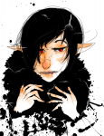
      I've gotten a lot of feedback on his nose and how to fix it, so I should fix it very soon. I just need to find where I put that photoshop file...
  • Mar 26, 2012, 1:41:53 AM UTC
    Oh man I LOVE the colors on this one. I know you said Detah's nose is crooked but I think the way you have it here makes it look less crooked and more simply put in the wrong place: Google "crooked noses" and you'll notice that the nose is still, fundamentally, in the center of the face. The crooked part of it is usually the bridge of the nose, as a result of physical trauma or what have you. The tip of the nose is still in the center of the face though, typically, so your nose here looks a bit strange. This might have been unintentional. My suggestion? When you draw, flip the image horizontally to see if anything looks strange, and fix it while it's flipped. Then go back and forth until the face is reasonably symmetrical, and nothing looks lopsided. I also think the mouth is a little low, but that could just be the angle of the head; if that's the case, the eyes are too high. For help, try looking up references of heads at different angles and study where all the face-parts go depending on how the head is turned.

    As for hands, I agree with Arkillian; try making a trapezoid-like shape for the palm (the tiny end being the wrist and the wider end being where the fingers will go) and draw your fingers from there. The thumb will jut out at an angle from one end.

    But the coloring is definitely fantastic! It looks very ink and watercolory, and I love the blots around the bottom. Very cool!
    • Apr 1, 2012, 5:23:25 PM UTC
      Thanks so much for all the feed back, really! I will help me out a lot! I'll keep everything you said in mind the next time I;m having issues with faces and placement.

      Thanks so much!
  • Mar 25, 2012, 11:48:39 PM UTC
    I love the colouring style on this Smile I find hands are easier to draw if you do the box shaping for the palm first. It not always as easy as that, but it's a good start for judging where the fingers start.
    • Apr 1, 2012, 5:20:38 PM UTC
      Oh thank you! <3
      And doing a box does sound like a good plan. I do draw a really rough shape for hands but it's not very... box like? Maybe that's why the pinky and the thumbs are always misplaced.
      Thanks for the help!
      • Apr 2, 2012, 3:01:46 AM UTC
        Simplifying difficult objects is the best way of drawing. If you can draw simple objects, all complex ones are are simplified ones with details. You'll find alot of complex shapes can be broken down like this Smile