"You're Here!"

Posted Mar 26, 2012, 11:54:58 AM UTC

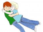
This picture of a very young Quatre Winner and Trowa Barton is for another Gundam Wing project I'm working on called Project Neverland. The basic story is "What if the Gundam boys first met as five year olds, but couldn't remember it?".

There's going to be two companions to this picture: one called "Can We Keep Him?", where little Quatre asks his father if he'll adopt Nanashi to be his brother.  I'm not going to name the second here because it'll spoil the story,

On a personal note, I swear my scanner must hate, loathe, despise and abominate colored pencils. I had originally colored this with Prismacolor pencils and it looked great when I'd finished.

Then I scanned it and everything went to .

I touched up the color in MS Paint (except for the boys' jeans; the pixellation actually looks like denim), and will redo the ink work and shading in Xara Designer.

Gundam Wing © Sunrise.

Post a comment

Please login to post comments.

Comments

  • Mar 30, 2012, 7:31:12 AM UTC
    All scanners hate traditional art. I have a really good scanner and still have problems :<
    • Mar 31, 2012, 11:25:02 AM UTC
      Oh, I know! This is actually the second colored pencil drawing I've scanned that's had a mess made out of it.
      • Apr 1, 2012, 3:12:37 AM UTC
        What did it do to this picture? Make the pencils ripple?
        • Apr 1, 2012, 9:46:38 PM UTC
          Nah, just made them look smeared.
          • Apr 2, 2012, 1:16:26 AM UTC
            There could be a few problems with that. If the glass on your scanner smeared at all? If you have micro cloth, clean it with that- it may be dusty or something. Cheaper scanners also can have scanning issues. My old Mustek scanner use to scan everything blurry cause the quality of the technology in it wasn't great, where my canoscan was super sharp- so sharp that I had to turn off the sharpen mask cause it accented my flaws too much. The resolution of the scan is important too- if you scan at low resolution then it wont pick up finer details in your art. Lastly, if it scans as a JPEG, be sure that isn't introducing artefact as well.

            I use a Canoscan 25 at home, and I use Photoshop to bump the blacks to black and stuff, and I scan at either 300 or 600dpi and my pencil art turns out ok Art thumbnail . I do use heavy weight card now though, and a higher grade pencil than I use to. This is with the lower grade paper with student grade coloured pencils Art thumbnail . I had to fight to get the paper ripple marks out of my scan, and the pencil doesn't take to the paper too well giving it blank spots that hte scanner highlighted... I couldn't get the background colour to scan nicely either. It was ok though. Much better than my old scanner that turned everything a faded grey colour. The scanner makes copics look very blotchy too :/

            I dont' know if knowing this helps you at all, but if your scanner is a cheap one then you can do a little better, but sadly this wont save you from going to an over render of your art, or stop colour shifting and glare off the pencils. No scanner can fix that. We do our best though TuT
            • Apr 2, 2012, 9:27:22 PM UTC
              I'm using a Lexmark 4500 series all-in-one. It made the green pencil I used on Trowa's t-shirt look like it had rubbed into the original flesh tones I'd used on his and Quatre's arms.
              • Apr 3, 2012, 3:45:15 AM UTC
                Do you mind if I see what you mean? Just reply with an attachment of the scan Smile
                • Apr 3, 2012, 11:30:55 AM UTC
                  Here's the original scan.
                  Image attached
                  • Apr 3, 2012, 10:27:19 PM UTC
                    To be honest? Your scan turned out alot better than I was expecting from your description. I suspect that the scanner didn't do a great job with the pencils but it's actually done what I expect out of a scanner. The rest is all to do with how the pencil is laid out on the page. You'll always have some sort of consistency issues- even with high grade pencils. There will always be colour change it's cause you're using light to pick up a subtractive colour scheme. The internet will forgive you for that- I promise (if they don't, give them a kick on my behalf). It can be made a bit better by using techniques to smooth the pencil out. If you put white on top of your colour it'll do what's called 'burnishing', and make your pencils a more solid colour. This may not work with very cheap pencils as they're too hard, and if you work on thin paper (printer paper or lighter- 80gsm weight lets say) then it'll tear a hole through that (I had issues with 110gsm but it's ok), but that can flatten pencils out which look nicer. You reapply your colour on top of that though if you want the punchy colour cause white will pastelise the colour Smile Other things you can do is to colour with small circular motions to not give the impression of a pattern. Use lines if you're wanting to give texture like with hair, but for something flat, small circles can diffuse the texture. IT still looks a little rough, but atleast it's covered in a flatter way.

                    You're going to have troubles scanning anything traditional, but if you shrink the image and take precautions before you scan it, you can come up with something that to me is nicer than the flat textures of digital. I mean, to me, I prefer the original scan to the digitally enhanced one. I like the look of pencil alot. I sympathise with the information loss, but this isn't as bad as you think. Try to be a little less critical of your scans. It'll all be fine Smile

Art RPG

Characters

No characters tagged

Share


Tags

  • Duo Maxwell - NOH8
  • Mary Marvel
  • Relena Darlian - NOH8
  • Hiiro Yui - NOH8
  • Trowa Barton - NOH8
  • He's Burning Up - WIP

Visibility

  • ✅ is visible in artist's gallery and profile
  • ✅ is visible in art section and tag searches