
Green Lantern's Light
Redrawing an old picture of mine of Kyle Rayner as Green Lantern as a birthday present for myself
This has taken an obnoxiously long time to draw but it was completely worth it ^^ The space in the background took me AGES to draw *u* Um... I haven't sealed this yet cause I'm still asking for critique on this but only for a little while longer cause I'm not 100% sold on the final product. If you have any constructive feedback for me, please comment. I may just be tired and love it in the morning. But I'd like thoughts before it's a one way trip though... (Please note that Coloured pencil leaves a stain so some things may not be achievable)
And thank you to those who have given advice on me to this picture!
Media- Polychromos on Hanemulhe Stella card, A4 in size
Head crop [thumb32445]
Post a comment
Please login to post comments.
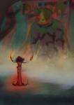




The background should be a complimentary color to the dominance of the green, say a deep orange or even a subtle reddish hue, but dissimilar to the color of the face. And yes, the glove needs more detail and should be less bright, as it's drawing the eye away from the focal point which is really the face.
I hope I've helped just a tad.
Keep well! - Andrew
I figured that the gloves needed something. I'll do them last though so I get an idea of what colour to make them
You've helped me alot ^^ Thank you for your thoughts! It's been a bit of a stumbling block what to do. I considered green, or Space, also putting his team in. None seemed to work. I'm still learning colour to make it worse so I'm not confident with them yet. I'll give it a go and see how it looks though :3 thank you!