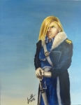
Queen Serenity

Posted Jun 11, 2012, 7:53:37 PM UTC

Queen Serenity - of the original Moon Kingdom - from Sailor Moon.  It's to celebrate the re-translation of the Sailor Moon manga, but it got delayed due to Fanime =)

Post a comment

Constructive Critique requested.

Please login to post comments.
Comments

  • Jun 12, 2012, 9:29:35 AM UTC
    What kind of critique would you like on this?
    • Jun 14, 2012, 5:34:52 AM UTC
      Just whatever jumps out, really Smile. The main thing I was playing with here was lighting but I'll take crit on any part of it.
      • Jun 14, 2012, 7:29:31 AM UTC
        Alright... Well, I know that this is all un changable things, but I feel that the background could use more detail. I can see that you're trying to give the illusion of distance with fuzzing it out, but to fuzz it out that much, the other end would have to be like... 50 kilometers away or something crazy, or the whole room filled with thick mist. I assume it's a long corridore- you'd see all the pillars (not with detail), but you'd also see the contrast of the canopy versus the sky, and a horizon line in the distance. Maybe small details like armour or chairs would be a lovely touch. Small details that make it look as thought out as the forground will make the viewer's eyes linger for a long time to look at the whole picture.

        My other thing is your colour choice for her dress. I can see that you wanted to make her pop more by not sharing the blue on the dress, but it's scanned a warm grey colour which distracts from the moon lit feel the background has. I think a better choice of colour would be a cold grey- a grey with a bluer base rather than a browner one. I'm still new to colour, but I feel that the colour choice makes her look like she should be in a warmer backgrounded picture. Cept the hair. The hair works Smile

        I'm not sure if that helped but atleast the background one I'm certain about. Smile
        • Jun 17, 2012, 6:19:22 AM UTC
          You can probably tell I fought with that grey XD I don't like using straight black paint so I was mixing, and I think it did turn out a bit on the warm side. I probably didn't notice because the background was warmer at that point.

          Speaking of, yeah, I see what you mean. It's supposed to be barren, but the lack of a horizon is a bit too ambiguous. I'll have to keep that in mind Smile

          Thanks!
          • Jun 17, 2012, 6:29:35 AM UTC
            How much do you know about mixing colours to make a grey without the black pigment, and about how colours are compromised? Is it something you've researched? Or just play by ear? I've got a book on watercolour, and learnt a bit about colour mixing from it but it's just for water colours, not for coloured pencil like I use.
            • Jun 20, 2012, 9:19:29 PM UTC
              Most of my color mixing comes from oils painting. <i>Most</i> of it transfers, but watercolors don't always work quite the same. Like mixing prussian blue and burnt sienna is always either on the blue side or the brown side, I can never quite get that true grey that I get with oils. I think the grey on her dress was mostly Winsor violet and yellow ochre, but I have a very bad habit of not recording my color mixtures ^^;. It probably had a little prussian blue in it as well.
              • Jun 20, 2012, 10:31:12 PM UTC
                IT's a good idea to keep swatches. All of the tutorial books I have suggest making swatches of colours in various states, and colour combos you like. I use to referance my copic one alot, but I'm much more familiar with my colours now so I don't need to as much now. I need to do it with my coloured pencils, btu this is VERY important with a one way trip like watercolour. Get a peice of your good card so your swatch is true to what you're putting it on, and make a 100%, 50%, and a watered down version of each colour so you know what tints you have. I'm not sure what colours are closest to primary colours, but look up some water colour books- they'll know what colours are good for base colours cause what happens is your prussian blue may have a high level of red and yellow in it to give it a nice colour. This is all good straight, but if you mix it, the colour wont be as vibrant as you'd like it to be cause if you mix the hues evenly, you get grey. http://www.amazon.com/Color-Theory-Made-Easy-Approach/dp/0823007545/ref=sr_1_31?ie=UTF8&qid=1340231075&sr=8-31&keywords=color+theory I have this book and it had alot of great knowledge on watercolour. I read it and realised it wasn't as useful to me, but it opened my eyes about great new approaches. They have an interesting approach of using CMY as their primaries which angers alot of people, but it makes sense for ink based product. Donno, but if watercolour interests you, I'd suggest hunting it out Smile