Class assignment (done)
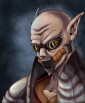
So I finished this a month ago but my teacher just gave it back to me today. I'm really proud of this and I didn't think it would turn out as good as it did. The last monocromatic drawing I did turned out horrible. I was so scared that I would screw this up with color (especially pastel) but I'm glad I didn't. I'm alittle disappointed with the face and it looks a lot better when it's a thumbnail cause the strokes aren't as visible but oh well I like it anyway. I'm so happy with this and I hope you all like it too :grin:
Post a comment
Please login to post comments.
Comments
Charha This is really cool. The colours are well-chosen. Great job!
Jilly Thank you! I'm glad you like it!
Saiyangirl4ever Wow! This is awesome!!!! This work is worth of applauses!!!!
 The colors are great and the shading is awesome too!
 Great work Jill! I love it!

Jilly Thanks so much I'm glad you like it.
ArkillianDragon Aaaaaah... The school years with the pastels ^^ Those things are good, but if you want smoothness, I wouldn't use them. If they are the pastels I'm thinking of, they're only good for texture. Oil pastels are better for a smooth finish. I'd paint it if you want a smooth finish at school. The other thing is that you don't have to use just the one colour- monochromatics are funky, but you can put extra colours on top with most rough colouring styles to give some extra interest. I did a similar thing wiht this OLD painting http://www.deviantart.com/view/5509699/ Where i've blended nearby colours in to acsent it. Just a thouhgt
Jilly Thanks for the comment and I checked out your painting and I think you did a great job with it I love the lighting. The reason why I didn't use any other colors in this besides black and white is because...well it never occured to me to do that. My teacher said one color and one color only along with black and white. And If I did use any other color I'd probably screw it up. I've never really considered using oil paints I'm not big on painting I try to stay away from it.ArkillianDragon *psst* All art teachers have theri head up their butts hopeing you'll come up with something spectacular with their million and one limitations. You don't make the othe colours obvious, but if you're only alowed b+w, then watch when you blend them. If you know where yours whites will be, leave them alone- You don't have any pure whites on this page, cause they all have blue under them. See- art teachers don't tell you that. They expect you to KNOW.Jilly  That's very true. My teacher expects college level stuff from everyone in my class. GIVE ME A BREAK LADY!! jeez...man that'd be awesome if I was brave enough to say that to her.
ArkillianDragon Hon- they want you to show potential and artistic flare. By narrowing yourf media to 3 pastles, they can see if you can make an awesome pic- if you can do this, then you can do something just as cool in colour. Its all about feeling the subject, and drawing something interesting- not nessecarily true to form either. Making a statement in this case. Just use what the teachers give you as a guideline, and toy with everything else. Remember to put your subject into one of the thirds of the picture, or the center but symetically, and use light to emphasis your subject, even if the rest of the light isn't realistically correct. If it looks right to the eye, it'll catch attention. These are things the teachers unfortunatly don't teach till you get to a real art school. Not that I have ^^;Jilly Yeah I know they want to see potential and all that but sometimes she can ask alot. But oh well I'll just have to listen and make the best out of it. I'll be sure to keep those things in mind about making the subject stand out thanks for the tips.
ArkillianDragon May I add that having the light below him rather than above is cool- gives a depressed look to the picture, which is what he looks like he is feeling :nods:Jilly Yeah I like the light in here too especially on his jacket. The bigger version shows much more of it but I couldn't fit it all.
Lilimayhem lol i hadn't even saw it! I agree, great mind do think alike!
 This is good Jill, i really do like the color and the light. I dont see anything wrong with the face, all the proportion are ok too!
  Great job!
Jilly In my eyes I think I messed up his face alittle cause to me it seems to pop out of the picture but oh well thanks for the comment
Lilimayhem ah yeah, i think i know what you mean. But in a way, it gives a look to him, like he's maybe more than what he seem. For me in art there cant be anything wrong...art is art...
MoonDemon Maybe if I put my glasses on I'll see what you don't like about the face, but since I don't feel like hunting them down I think it looks TERRIFIC!!! Kinda looks like one of the dudes from DreamCatcher, to me. <FAV >
>Jilly I don't know what it is something about the face disappoints me I liked it better when it was a drawing.. ah well. I love that movie! Hey you're right he does look like someone from that movie.


