Tidal (CF4)
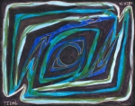
This is probably the least interesting of the series. The scan is unflattering, though... it's much more attractive in person, even though I can't figure out what exactly is wrong with the digital image. Something about it is just plain off.
I meant to use a green-based colour scheme for this one. That plan failed utterly.
I meant to use a green-based colour scheme for this one. That plan failed utterly.
Post a comment
Constructive Critique requested.
Please login to post comments.
Comments
Nothing but crickets. Please be a good citizen and post a comment for
Art RPG
Characters
Share
Tags
More art by KnifeSmile
")
")
")
")
")


Visibility
- ✅ is visible in artist's gallery and profile
- ✅ is visible in art section and tag searches