The Ultimate background guide
Background Factors:
-
Number of elements (fore- middle- backgrounds, objects, etc. )
-
Detail of elements (how complex are the single elements)
-
Colors and shading (how much variety and effort have gone into the elements)
-
Quality of background compared to the characters (does the style/effort match?)
All of those factors make up the essentials of a background. By nature they interact with each other and we try to look at all sides of them. A background should not neglect any of those factors but the degree to which factor is expressed can vary.
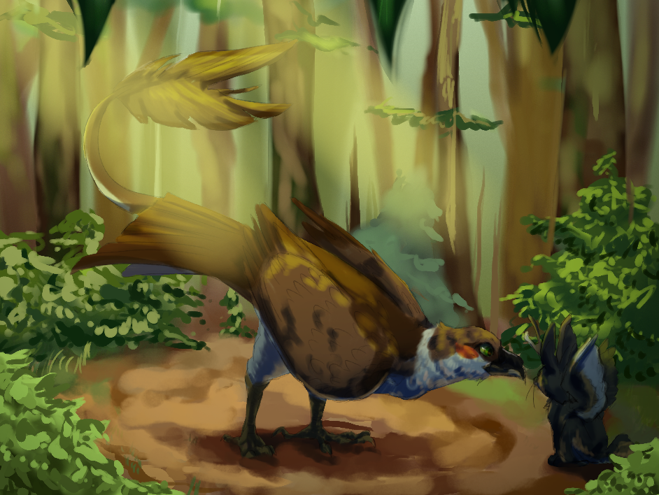
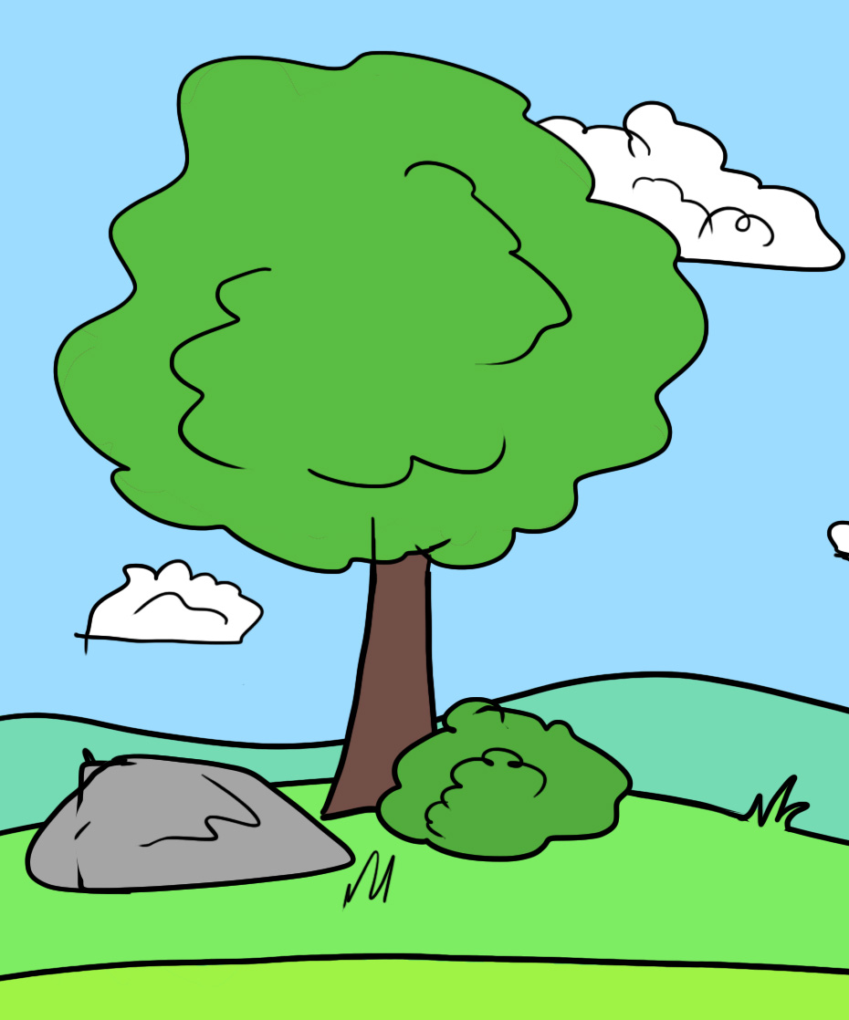
Let’s explore the different aspects of a background using this image with our starter Cloud:
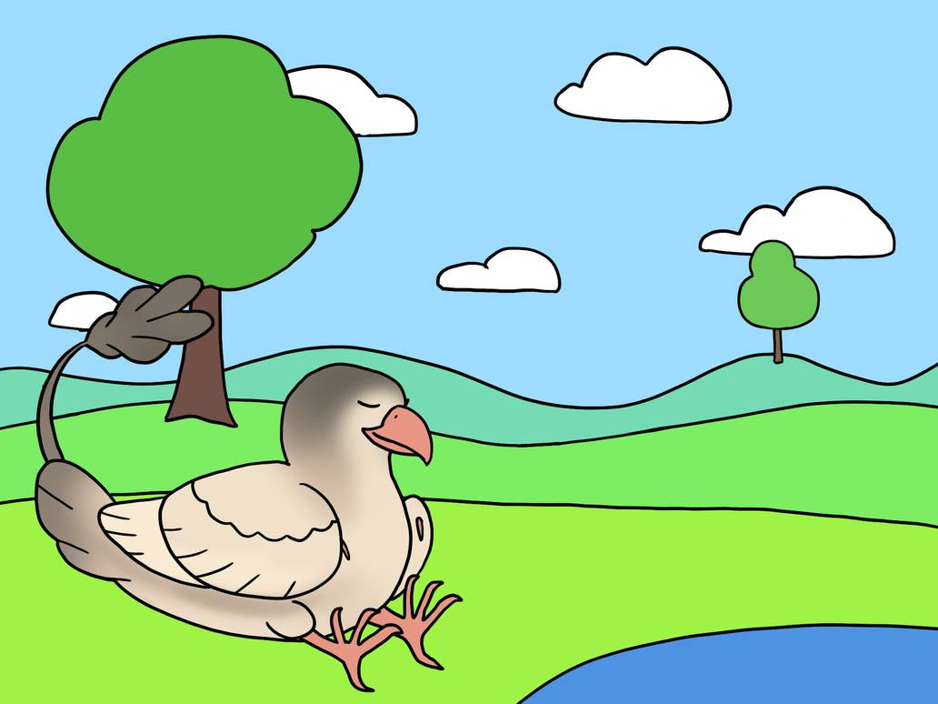
If you are a beginner artist just learning the ropes then your backgrounds could look like this. It would, however, not pass for anyone with a little more experience since it would look rushed.
While the basic requirement of having three planes (fore- middle- and background) are met, there are only a few objects which have simplified shapes and the hills are curved lines drawn in one motion.
(sidenote: we are aware that your lines won’t be as smooth if you just started out drawing, especially if you are new to digital art, so don’t worry too much about it)
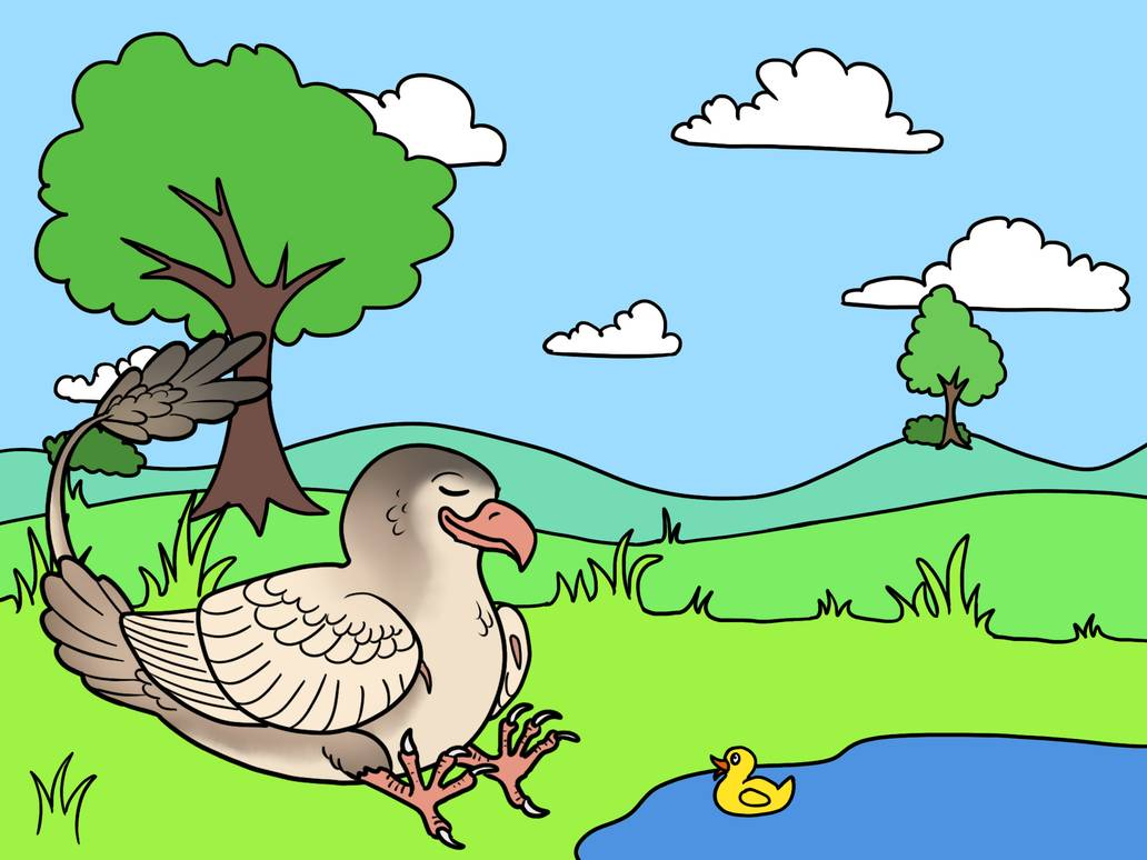
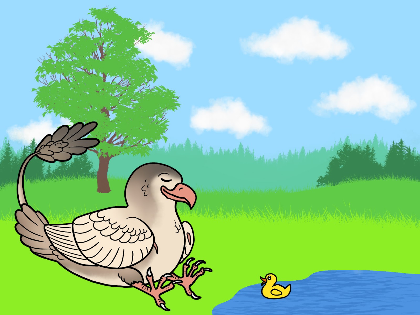
Let’s try to give this background a little more edge. The clouds receive just a few more arches, the trees get branches, bushes and strands of grass have been added and a little ducky is here to keep Cloud company.
This is a suitable background for those players who have grown familiar with the tools they use. For our players with galleries full of art however we have a little higher expectation.
Below you can find four methods of enhancing your backgrounds. As mentioned all factors weigh in when we count AP but they do not need to be addressed equally.
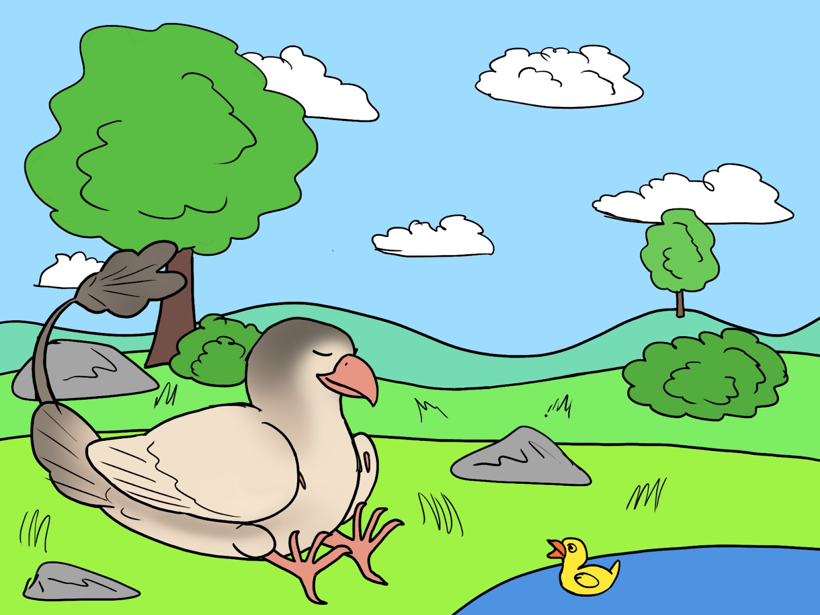
Number of elements
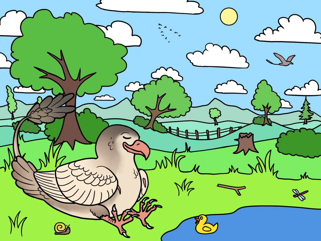
A background can easily be brought to life by sprinkling in a few more background elements. This can be achieved by adding multiple planes in the fore- middle- and background. You can also enhance the background by adding diverse objects, like clouds, flying birds, flora, and fauna etc.
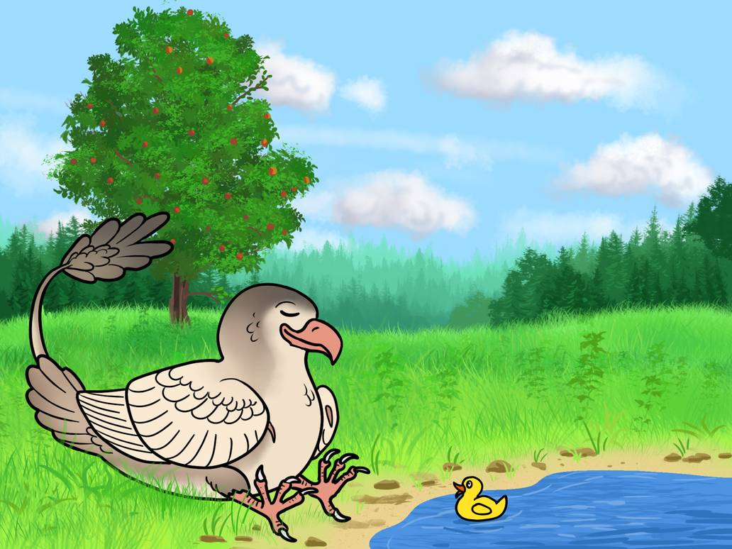
In the picture below, you can see that more elements have been added like hills, mountains, more objects in the sky, and on the ground. Get creative with the elements and have fun with an immersive scenery!
With a little creativity and love, artists of any skill level can use this method.
Detail of elements
Going a little more in depth with detail can really make an image pop. You can use various line widths and different colors for your objects to make an image look more intricate. Adding the fine details can make a big difference.
In this case, all of the previous objects received some love. This requires a lot more brushstrokes and you cannot do this kind of detail quickly. And that is the point, it takes a little more time but the pay-off is substantial.

Colors and shading
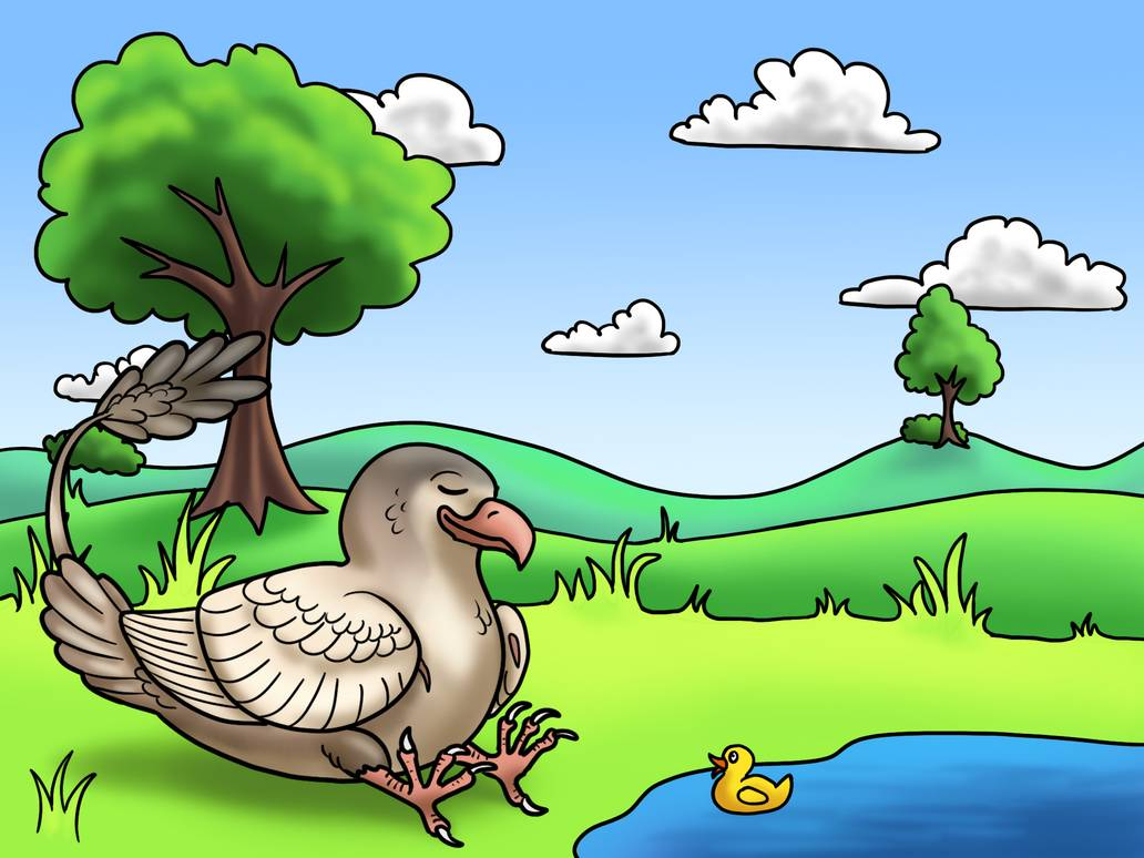
In the image below a simple soft brush was used to add lighter and darker areas. By adding a gradient to the sky, and giving the objects their own shadow, it makes the image look like it has more depth. This simple method can help with adding depth as it is much more interesting to the eye than flat colors.
There are many different methods of how to shade and color your art, from hard to soft edges there’s something for everyone, so do not be afraid to try out new methods to find the best fit for you!
Quality of background compared to the characters
Artist tip: Starting backgrounds is hard. There’s much to think about, rules that suddenly are important (like height relation of characters) and henceforth, we judge them accordingly. Having a full gallery makes it easier for us to discern if you’re a beginner, what your average is, and when you’re genuinely trying to show off everything you can do. We’re more lenient if we can see you just started, because nothing is more discouraging than rejection for your best efforts.
What’s important to us is that your character looks like it is inside the background, and not plopped in front of it. Having shrubbery cover feet or parts of the body can help on a flat colored drawing, adjusting shading to match the surrounding is an efficient way to create a sense of unity!
And while they are really gorgeous, you need to make sure that, if the background drawing is smaller than the Stryx, that it doesn’t end up looking like the background is secondary. You can prevent this by making the Stryx look like it is flying “out” of the frame, or it affects items inside the background with its shadow. But since it is very tricky, it’s better to stick to a full background drawing especially as a newbie to backgrounds.
But if you do want to have a cropped background, you need to ensure it looks like the Stryx flies “outside” of the background, and is affecting items inside the background, like shadows on tree tops, or bushes being pushed aside as the stryx strides out of the forest. Remember, the less background is shown, the more you have to make those bits count.
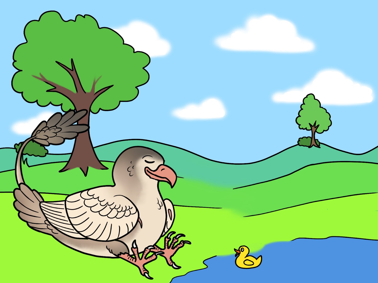
To give a visual guide, here’s Maki meeting a Forest Wolpertinger!

This drawing will not be granted a background bonus if you’re experienced. Maki and the Wolpertinger are fully fleshed out with shadows and highlights that suggest a foresty background. But there is no cast shadow. The background does cover three planes of depth with trees as the background, a flat sand bed and very blotchy bushes as a middle ground and the shape of a tree and another blotched bush as the foreground. This is okay if you just started drawing backgrounds. Learning details is hard, takes time and a lot of patience. Especially foliage can be very overwhelming. And we can excuse the vast difference in quality if we know your gallery is full of background-free fullbodies.
This is what we expect of experienced background artists. There’s variation in trees in the background, the foliage is multilayered and the ground is shaded with cast shadows suggesting the light comes from a strong source, there’s also grass covering bits, and both animals have their feet lightly dug into the sand.
Stamps
Stamps can be a really powerful tool to give your art a sense of realism. The temptation to rely heavily on them can be strong however. Look at this image for example:
It looks really nice right? No, only on the surface. The entire background is made up of brushes; the clouds, the pine trees, the tree in front, the grass and water. Not a single brush stroke was necessary, there are no layers or color variation. Use of stamps like this will get dinged.
Instead let’s have a look at an acceptable form of using stamps.
This image here still relies heavily on stamps, BUT they are used smartly. The clouds consist of several different cloud brushes as well as use of a soft brush. The trees in the far background have several shades to indicate distance. The nearer pine trees are a mixture of stamp brush and hand painted details.
The meadow consists of several grass brushes combined with several different colors to show depth. The tree received a similar treatment with a few manually painted branches.
In the foreground a sandy bank with rocks have been added and the grass overlaps Cloud. If you want to use stamp brushes you have to commit and think of how to integrate the stamp brush into your background.
Using a grass stamp on a straight edge like this here is not good use of stamp brushes. The shape of the stamp is cut off where the lineart starts.

Artist Tip: It is generally not easy to combine lineart and stamp brushes. If you are unsure, it is sometimes better to hand paint details instead of relying on stamp brushes.
How to spot rushed art (sloppy coloring, overlapping lineart, …)
Lineart
This is our basic background with a few more elements and details. Looks good right? Why would it get dinged!?
Let’s take a closer look at the lineart:
-
Clouds: Many overlapping and untidy lines
-
Trees: One single brushstroke for the entire outline of the tree. Details drawn in one quick motion
-
Rocks: rocks come in all shapes be it hard edged or rounded, however almost no rock looks alike. The rocks here are all just round blobs with random lineart in it. Rocks usually have harder edges, drawing them all rounded makes it look like a deliberate shortcut. (there are round rocks too but those are not the standard)
-
Grass: The sharp blades are curved and round. If you pick up a pencil and quickly draw up and down that’s the shape you get
-
Bird: The lineart here is very untidy and overlaps. There is feather detail but it is very wiggly and imprecise.
I still don’t see how this is rushed?
Let’s take a closer look at this crop of the image.

On the left is the background above cropped. On the right a version of it that would pass. A small explanation of what was done differently with the lineart:
-
Clouds: Line not drawn in one motion but several connected arches
-
Tree: Instead of big fast lines there are more bends and curves
-
Rock: Rock has more jagged and sharp edges and inorganic shape
-
Grass: The blades meet in a sharp point rather than one connected wave
Colors
Not everyone likes a background composed of just lineart. Nature is rarely as compartmentalized as some of the above images. If you like a less line-dependant background, there are a few things you need to look out for when coloring.
Art Tip: This does not apply to traditional art as artists usually have to work with limited color palettes.
Let’s take a look at the images with reduced lineart below:

This looks kinda messy. The lineart here is more natural and does not form compartments, instead one background element flows into the other. However the gradient from one color to another overlaps where there is line art.
A smooth gradient works well where there is no lineart, but when there is a firm line it should be seen as a firm divider or it will look as if it was painted over quickly.
This is the same lineart but the background now looks much tidier. The border between the colors is firm wherever lineart divides it and blended where there is none.
Background variation
Ap sheets are a fantastic way to earn AP and draw your stryx in various fun poses.There is temptation to use the same background concept for each image and just slightly alter it.
However, we don’t want mass produced art. We want to encourage variation and creativity.
There are three major factors we consider:
-
Color variation
-
Variation of background type (mountains, hillsides, canyon, oceans,...)
-
Overall quality
Artist Tip: As usual a mix of all three is best!
Here we have Cloud in the mountains. The variation of expression is good, however the backgrounds are all similar: green mountains with snow tops, hills, pine trees and a grassy foreground.
Not only is the type of background all the same (mountains), it also uses the same colors. From afar, these three backgrounds look like they are one consecutively drawn background split into three.
Ap sheets like this will most likely be only counted as one background. While the lineart itself is different the concept and the colors are the exact same for all three backgrounds.

Color Variation:
Can you spot the difference? Well if you said that the colors are the only thing that is different then, you are correct! It makes the AP sheet much more interesting and makes you wonder what Cloud is up to. Essentially, go nuts with colors!

Type variation:
Here we can see Cloud in different geographic locations: mountains, hillside by the river, tropic islands
All three backgrounds rely on the same color scheme but each one of them is unique. This is a good variation of background type that lets you explore the many faces of Wyvera.

Quality
You can draw your stryx in a similar environment using a similar color scheme, we aren’t saying you can’t. In this case, however, it needs to be clear each background was created with love.
There should still be distinct objects unique to each background. If you like to do photography, you will know that you can showcase one and the same landscape in a thousand different ways. Get creative! Just look at all the tons of different pictures of the Grand Canyon lol.
Pixel Art
Art under 300x300 is no longer simplified by default, pixel art is now eligible for its own bonus. However it has to be pixel art and not just downsized regular art.
Each of the pieces below are 150x150 pixels big and you can immediately see the difference.
Left: This has been drawn using regular brushes and tools on a small canvas. The lineart looks blotchy and the colors and shading blurry. You cannot see individual pixels. This it not considered pixel art.
Right: Here only a hard pencil tool has been used and as a result you can easily see individual pixels in the image. The lineart and shading are crisp and you can see "stray" pixels. Even the gradients are made of pixels.
Soft markings like the wispy pangare on Cloud here can be really difficult to immediate with pixels, there will be some leniency in this area.
(original size)

(upscaled for easier viewing)
Cloud import: https://www.deviantart.com/eyeofgalyx/art/Cloud-463-563181025
This guide was made by Aerophoenix