We're about half way through the month of November and the Huevember challenge and there's one mistake I see artists across the interwebs making with the Huevember challenge that I just have to tell you about. I want all of you to succeed as artists and become the most awesome you can be. My hope is that by sharing this it will help you get more out of the rest of the challenge and to grow in your understanding of color theory.
What is Huevember?
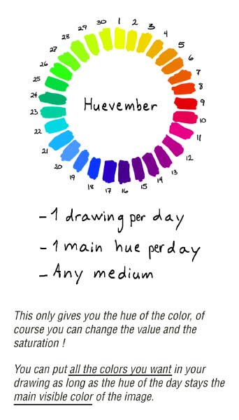
If you're not familiar with the Huevember challenge, it's a global daily art challenge similar to Inktober, where you create a new work of art each day in the month of November using the provided hues, a different hue for each day.
The mistake you might be making
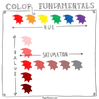
The mistake I see artists make is using the color verbatim from the huevember wheel without adjusting the value or the saturation. Just as a quick review:
-
Value is how dark or light the color is
-
Saturation is how much of the hue is present in the color
As a note, the official huevember challenge instructions explicitly state it's ok to adjust the saturation and value.
Why is this a problem?
You'll get a lot more out of the huevember challenge and grow more as an artist if you practice your understanding of color fundamentals, and that includes knowing how to use saturation to tell your story.
Let me be clear, I'm not saying that creating art with full saturation is a bad thing. Quite the contrary, I love bright colors. (I mean, seriously, have you seen the way I dress?)
I just want to make sure you are being intentional about the saturation and the value. If using the color exactly as it is in the huevember wheel is what works best for the art piece you're creating, then great. More power to you. I just want you to be using full saturation as long as it's an intentional choice rather than as a default.
Try a muted palette
To help you get practice working with saturation, try creating a work of art using a muted color palette (also known as a desaturated color palette) as part of the huevember challenge.
A muted color palette is when you create art where most or all of the colors are desaturated. You'll find examples in this muted color pinterest board.
Just like with the analogous and complementary color palettes, the muted color palette is another tool you can have in your artist toolbox to help you achieve great color in your artwork.
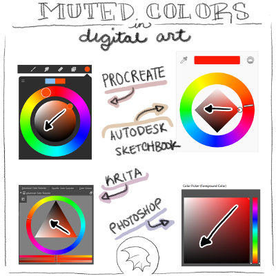
How to create muted colors
When working digitally, the process of creating muted colors is easy. Just sample the color from the huevember wheel and in the color picker window, start dragging it closer to the greys. You could also search for muted palettes on coolors.
With traditional media, you can achieve muted colors a number of ways:
-
mix the color with black
-
mix the color with the opposite color from the color wheel (E.g. purple with yellow, orange with blue, red with green)
-
mix the color with brown or earth tones

Using saturation as a focal point
On a related note, another tool you can add to your toolbox is to use high saturation sparingly to create a focal point in your artwork. Meaning, use a muted palette for the majority of the artwork, but then use high saturation in key parts of the artwork where you want to draw the eye.
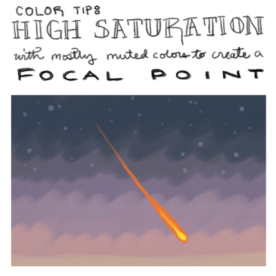
Here's a work by Stephanie Law done in watercolors and gold leaf that illustrates this concept. You'll notice most of the colors are very muted except for the orange mask on the bird and the red ribbon. The bright colors create a focal point.

Conclusions
Huevember isn't over yet so if you haven't started it's not too late. You don't have to do all 30 colors. Even just getting a few in is great practice and will help you improve. You can always change the Huevember rules to make it more applicable and realistic for you. And you can even earn some XP along the way.
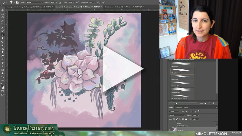
If you'd like to see a timelapse of an artwork created with a muted palette, check out the later portion of my video on this topic.

Give this a try and let me know how it goes!