
scaring me to death.
it's not even light out
but you've somewhere to be
uh, i'll excuse myself by saying i listened to "The Moment I Said It" by Imogen Heap too many times today.
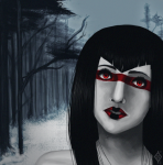
anyway, decided to be a little daring to rid myself of my artistic frustration, so i did this.
A PORTRAIT AND A BACKGROUND?????
shocking, i know.
i really hate how i do noses, but i already see improvement from my first portrait of Condesce, so i'm glad i was able to learn a few things down the road with this.
i hope you guys like it! (;
art © me
reference photo © [link]
but you've somewhere to be
uh, i'll excuse myself by saying i listened to "The Moment I Said It" by Imogen Heap too many times today.
anyway, decided to be a little daring to rid myself of my artistic frustration, so i did this.
A PORTRAIT AND A BACKGROUND?????
shocking, i know.
i really hate how i do noses, but i already see improvement from my first portrait of Condesce, so i'm glad i was able to learn a few things down the road with this.
i hope you guys like it! (;
art © me
reference photo © [link]
Post a comment
Constructive Critique requested.
Please login to post comments.
Comments
Art RPG
Characters
Share
Tags
More art by franpoo


Visibility
- ✅ is visible in artist's gallery and profile
- ✅ is visible in art section and tag searches

![[link]](http://xaxor.com/images/other/2227/beautiful-girls-shareordiein-001.jpg)
I love the diffused look you've given the digital colour though. Digital colour is normally so flat. This has given it a great texture that's really subtle, but it feels right
and ohgod yes, i know! i didn't actually use the reference for lighting as much as face position and proportions! since there's barely any shadows at all i just kinda went with my gut on this one ahahaha. WHICH SHOWS SOB.
that link is wonderful though, i'll definitely keep it in mind for future pieces, or if i decide to edit this image ;u;
and it's even clearer to see the triangle area you mentioned for the cheek - definitely gives the face a lot more dimension, i'll try to apply properly this next time!
again, thank you so much, you've really helped! C: