
Pledge
Pledge.
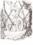
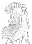
I am wondering though, can anyone give any suggestions on making better contrast with pencils? One of the greatest problems that I spot in this picture (aside of course, from proportions and getting the right shapes) is that my picture looks the same throughout. The contrast between light and darker areas isn't strong enough so that there is no sense of layer...the wolves just seems to melt into the background and vice versa.
Post a comment
Constructive Critique requested.
Please login to post comments.





I was just curious though, how would you tell the difference between a soft pencil mark and a hard one?
For example, this pic [thumb24117] has HB around the face for a subtle grey shade and tone control, while the hair and outfit has up to a 6B lead in shading to achieve the dark shades. I use 2H for my construction lines http://fc07.deviantart.com/fs44/i/2009/064/b/c/Pencil_Tutorial__Sketching_by_Arkillian.jpg like this cause the 2H has alot of graphite in it which is easier to erase (unless you push hard) cause it puts less lead down at once. I think the range is 6H to HB to 9B. If you go too much higher than an HB lead, then the only thing that can lift the lead is a kneedable eraser cause it sticks to the graphite, and lifts it off. If you used an eraser on 6B it'd smudge + stain the paper. That may be a desired result though... Hope that helped ^^;
Thank you so much!
I see you have probably used a fairly hard pencil here, perhaps a HB or B. Maybe you can get more contrast in the darkest areas using a 3B or 4B quite liberally.
Just a thought. It's still a great piece though.
Yes, I was also thinking of using other types of pencils, although that would meant having to search out for it because art/stationary shops are scant in my area.
Nonetheless, thanks for your advice